Friday, 10 December 2010

A note from Chui.

What is Comparative Research?

It's a simple but multi-faceted device.

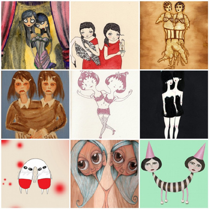
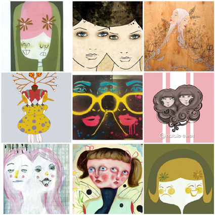
In order to appreciate great concepts and inspiring designs you need to search and find examples that usually fit into specific problems/challenges that you have in a brief.

By looking at how other illustrators/artists work with zines/artists book formats you can begin to compare your strengths and weaknesses, and more importantly identify what it is you need to work on.

It could be things that deal with the idea itself, or the design aesthetic, or both:

a collection
a journey
a sense of contradictions in what's written to what's drawn
a play with scale and perception
a sequence of mishaps
a bible
a dictionary of what not to do
a shopping list
a set of trump cards
an instructional booklet
a treasure map

Page layouts
Consistency of visual language
Use of limited colour palettes
Combination of text and image
The use of foreground and background
The visual experience of unfolding the pages
The feel of the paper
The awesomeness of the drawn details
The mark making qualites
The sense of emotion of the colours/drawings
The list is Fudging endless

Production for Visual Communicators An introduction

Novice to expert


pastedGraphic.pdf


I think that on the Novice-to-expert scale I would fall under the “Competent” section as I have a good working and background knowledge of area and practice. Although I do work to an undergraduate standard, I do think that my work could be more refined. I think I need to do a lot more sketching to help me to be able to finally polish my work to a higher standard. What I tend to do with my work is only create one or two versions and I do not experiment enough with images. I should start to think about the aesthetics that my audience are interested in and not just what I think is “pretty” or a good drawing. Although I am able to achieve most tasks using my own judgement, I would say that I need to gain more confidence in my work to have more tutorials. What I mean when I say this is that, when I do work I fear that it is not to a high standard or not enough there, so instead of showing my work in a tutorial I will just shy away from it, when this really defeats the point of my degree. I like to plan work, but I think I could plan to a higher standard. I like to work with my peers and find satisfaction when ideas bounce from one group member to another. I think that my perception of context could be slightly more backed up. I need to do a lot more research when I do projects, whether that’s artists or just background knowledge on a subject.

Tuesday, 30 November 2010

Development of Creative Thought and Structure in Illustration and Graphic Art

Restating Problems


I have encountered a number of problems whilst studying for Chui’s project in which we have been briefed to make a Zine or Artists book.

My Idea for this project was to work on tracing paper and make a folded book. I folded up my book and re-opened it to see in what order the pages were from cover to back. I then designed small illustrations on a piece of a4 paper and copied my a4 page of illustrations and printed it off on to tracing paper. Tracing Paper however, is trickier to work with than I initially assumed. I imagined it would fold just as the same as paper would, however it took many attempts for me to fold it correctly without destroying the image which was already printed.


Considering my problem from fresh I would have made a plan which would look something like this:


Look at different ways of binding a book and practice the techniques to find out which one i would prefer.


Test how to print the image on the page


Layout the images on the page before hand (although I don’t have a program to do this with so this could be a problem)


Draw on a larger scale and downsize (again as I have bought my Mac I do not have the program’s yet to allow me to do this.)


Developing Ideational Fluency


pastedGraphic.pdf

I believe that a mind map is different to a Brainstorm because I think that with a mind map is more visual and a more graphical way of taking notes. Images can be added to a mind map and it is a lot more affective. I think the activity of a mind map is to show whats on one persons mind, so would be more likely used as a means of recording just one persons thoughts as opposed to a larger group.


pastedGraphic_1.pdf


Brainstorm’s are quicker notes, written down when thought of. I think that a brainstorm is more of a group activity to get ideas down quickly as each person says them. The method of brainstorming was Popularized by Osborn, who stated that groups could double their creative input by using brainstorms to record ideas.

Sunday, 21 November 2010

Wednesday, 10 November 2010

Production and Outcomes- influences and reactions

Production and Outcomes: Influences and Reactions

Interpretation - Illustrators/Creatives select and use a ‘zeitgeist’ to interpret the message. Time and place has a great effect on their production...


pastedGraphic.pdf


This illustration is by Alfred Barbou, produced in 1882. It depicts the story of the Hunchback of Notre dame by Victor Hugo. Drawings from the victorian era seemed to be very delicate yet very dark at the same time. There are many gothic elements in this image which refers to the “Zeitgeist” prevalent in this period. During the Victorian era was a movement referred to as the “Gothic Revival” which began in the 1740’s. A lot of the gothic art in the Victorian era was an escape from the industrialization which took place at the time, because of this, there was a lot more leisure time, so art became something which people took time over.


pastedGraphic_1.pdf


Alfred Barbou’s drawing compared to David Hughes’ 2006 depiction of the Victor Hugo “The Hunchback of Notre Dame” story, is a lot more flat. With it’s 2d presence and flat colour, it is a lot more simple then Barbou’s image. Black outline on this image accentuates it’s more contemporary creative’s style. It is not realistic and was not aimed at being realistic by its creator in the first place.


Methodology - A thorough and versatile design process enables an Illustrator/Creative to work independently and professionally...


Design is the planning that lays the basis for the making of every object or system. To design, refers to a plan which will eventually construct something. The Term ‘design’ has different connotations in different fields, which can vary from structural planning for example notes alongside maquettes and models, to graphical planning; notes alongside images and drawings to show what will eventually be.

A plan, is essentially the final outcome stripped down to the bare primitive components. In other words, ‘Primitives’ are the elements from which the final outcome is composed.


“Everyone designs. The teacher arranging desks for a discussion. The entrepreneur planning a business. The team building a rocket.

Their results differ. So do their goals. So do the scales of their projects and the media they use. Even their actions appear quite different. What’s similar is that they are designing. What’s similar are the processes they follow.”


Development of ideas and structure in moving image

“Every movie needs to have a beginning, a middle and an end, but not necessarily in that order.” - Jean-Luc Godard


PRINCIPAL 1

At the beginning of the film “Zombieland”, the opening credits show a sequence of slowed down footage of different zombie attacks, not only from the title but from the opening scenes, the au

dience are aware that this film is about the undead. The protagonist “Columbus” is established as the voice over. He sets out “rules” in which the audience can follow to guide them through the film which has been initially set out as a zombie apocalypse. “Columbus” then shows the “beginning” of the Zombie take over, when his rather cliched dumb-blonde, helpless, beautiful neighbour runs in to his flat after being bitten

and turns in to a member of the undead.


The middle part of the film then goes on to show how “Columbus” meets “Tallahassee” (names given to the characters to narrow them down to the country they are from as they are no longer human beings with rights but statistics of humans that are still living) and how they meet “Wichita” and her younger sister who are all trying to get to different locations which they each believe is their safest option, however are playing their own selfish games against each other.
Along the way there is a romance between “Columbus” and “Wichita” as they try to create a mutiny against the zombies.
The Unity of time in the film is not fluid. There are scenes

of flashbacks to happier times, before the zombies were around, to make the audience understand that they once lived in “standard society.”


The ending is then left open but gains a happier tone as it shows that the 4 build not only a strong relationship but a “gang” to fight against the zombies.
The film shows around thirty minutes at the beginning to “establish” the criteria. It then has around an hour to show the main section of the film, and then finishes with around half an hour to end the film on a positive note.
This film relates to Todorov’s theory of “equilibrium, disequilibrium, new equilibrium.”


Character Design - four aspects of character.


Protagonist

The protagonist of the film I have chosen to write about is Harry Potter, The books and Films are of course entitled with his name, which insinuates to us that he is the main character/ protagonist.

Antagonist

The antagonist in the film is Voldemort... he is Harry Potter’s enemy “neither can die while the other lives.” It is clear that he is the cause of conflict as in each of the films he comes back with vengeance to try and become stronger and destroy the protagonist of the film.

Dialogue

The words used by characters can give a good insight in to a character so as the audience can understand who they are. For example Neville Longbottom, a cowardice but penultimately brave character in the series, is described with praise: “It takes a great deal of courage to stand up to your enemies, but a great deal more to stand up to your friends.”

Stereotype

Draco Malfoy is the typical school “bully” who boasts about his families’ financial circumstances and mocks Harry for not having parents. However we do learn that, like most bullies, Draco Malfoy is deep down a coward who puts others down in order to make himself feel adequate.


Appearance

Harry Potter has a geeky and disheveled look which deters the audience from his exceptional power and bravery.

Action

Harry Potter is the typical good conquers evil story. He is the “goody” and Voldemort, his opponent, is the “baddy” He has exceptional power and is the action hero of the films.

Interaction

Harry Potter has different levels of interaction with each character. Each and every character plays a vital part in the story and provides a link to all the back stories within the main story.


Harry-Potter.jpg

Wednesday, 27 October 2010

Some more conjoined twins imagery..

"And so he fell asleep dreaming about the most beautiful unnatural being he had uncovered yet."


Principals of the RVJ

error//:265

text cannot be displayed

Key Principles of Graphics

Tone of voice

Different imagery has a different tone of voice. Typography for instance, has an interesting way of catching the viewers eye. With typography every piece of design is vital... how would the word "whisper" work if it was in a huge, caps font?


WHISPER!


The answer is, it wouldn't work.
Some more examples below:


shout


bang


SECRET

Essentially visual communication is defined as:

"Visual communication is communication through visual aid. It is the conveyance of ideas and information in forms that can be read or looked upon. Primarily associated with two dimensional images, it includes: signs, typography, graphics, illustration colour and electronic resources. It solely relies on vision. It is form of communication with visual effect. It explores the idea that a visual message with text has a greater power to inform, educate or persuade a person. It is communication by presenting information through visual form."


Purely visual and with no words or icons, this piece works solely on the image. It is about building an emotive vision with the viewer... we know that this can not happen and the sheer cheek of the designer is comical therefore works to catch our attention.


This image works in a completely different way. Without the words the image would not make sense to us. With the image the words denote that this image is about the 9/11 attacks and we visualise the white lines as different journeys within the events of 9/11.

When a product is initially being launched and advertised, we need some kind of writing to process what the advert is about. When the product becomes worldwide and well known... you can take the writing away and use the same style image and it is powerful enough on it's own to advertise. For example the original ipod advert and the more current ipod adverts:


Researching content

Researching content? Problem solving? Getting your head around a brief? Whatever you want to call it, subject, audience and message are the three components towards breaking down a brief. By looking at the environment one can gain information, look at content and finally transfer it to different users. From Brief to final solution it should take spiral effect... so you should start with the information given and soar ahead gathering your own input and information on the way up to the 'final solution' stage.

Kolb's learning cycle show's how and where you personally keep track of a task:

Kolb's Learning Cycle


Sunday, 17 October 2010

My conjoined twins final image


This is my final image. I am really quite happy with it.. imagine it printed on to photo paper and the word "forever" in gold.. that's how it looks. Can you tell who it is? ;)


Black Film Festival

...

Thursday, 14 October 2010

Double Trouble

I'm starting to create designs of myself as a siamese twin.. I am starting off lightly with photo shop testing, but I am to end up with a dark and un-natural looking human. With conjoined twins, I am interested in the fact that something that has naturally happened within the womb, can seem so un-natural and make us look in disgust.


Freaks- Tod Browning

Yesterday

Tuesday, 12 October 2010

So my illustration project is about siamese twins?

Look what I just found?! It's crazy what you can find with a bit of research...


"What do you get when you mix a dark fairy tale involving Siamese Twins with paintings by fifty of the most innovative, off-the-cusp artists in the art world? A gorgeous, limited edition first printing of the book, Max and the Siamese Twins. Intrigue, lust, love, burlesque, and a whole lot of trouble, that’s what you can expect to find as you peruse the pages of this eighty-page volume."

Monday, 11 October 2010

Mail Art: A Journey

I have started a Mail Art project which I am really quite excited about!:


All you need to do is buy or make a blank postcard and on the front, in collage or drawing I want you to depict a memorable journey or place that you have either; been on.. would like to go on.. or have seen in your dreams.

When you have created the front image, just turn the post card over and sign your name or write a message, and add my address on:

Niamh Griffiths
Flat 8
Hazel House
Hamstead Hall
Friary Road
Birmingham
B20 1ap

It would be so interesting to look at everyone's journey's because I am aiming to create a final fictional journey to a fictional place by collaborating each design.


Key Principles of Illustration

Through the ‘visual practice’ of observation, collecting, studying and exploring, illustration can contribute to a deeper understanding of the subject.

Research is sometimes more important than the final piece you create. "Notebook after notebook after notebook because I feel sick when I forget a potentially good idea." Illustrator Paul Davis elaborates on the fact that every little detail that reminds you of an undergoing project should be kept record of in a notebook. I agree it is essential to keep note of any imagery, written notes, photographs, sketches, doodles, I wish I could do it more myself... you can never have enough pictorial information to help you create new ideas. Research is the key... any successful project needs a basis to work from, it can act as a tool and a stimulant to produce a finalisation of what you have been working on. You can create a bank of knowledge by just recording your thoughts. I always forget potentially good ideas and it bugs me to death. If you collate information you create communication! You retain information by looking at mediums so why not record that information in to your own visual language and look back at it? You must know your practice. "I do get stuck but only because I have so many ideas"... one day.


The notion of 'inspiration' derives from constant inquiry, based on research, observation, recording and experimentation.

Collecting things stimulates the brain. It helps you think of something fresher. At the moment my wall is my base.. It is full of all kinds of imagery and little 'notes-to-self' about projects. My most recent area of interest being about the 'abnormal' and the 'distorted' An artist which has inspired me greatly in this project Audrey Niffenegger. Her perfectly distorted images just make me feel a mixture of disgust, intrigue and fear.


This image "Self portrait as Siamese twins" has immensely inspired me. The way the two women are integrated as one is the first blatant thing I noticed, my eye then straight away hit the posture of the 'two-in-one' figure both bent backwards with their hands on each hip and two legs facing straight on. The thing that fascinates me about this painting is the normality on the women's faces.. Don't get me wrong I have no problem at all with the rare occurrence of conjoined twins however I can not get my head around how this happens completely naturally within the womb and cannot be stopped, yet when the "baby/babies" are born, we look on and feel a slight feeling of disgust and awe at how unnatural it looks. How is something so biologically natural become so unnatural to the human eye?

Inspiration can start anywhere and end up as the most polar opposite finalisation of your first idea.

Tuesday, 5 October 2010

ITAP lecture 1- connectivity

Notions of originality

There’s no such thing as originality. “Creations” are merely re-contextualised and reused developments from existing forms of historical culture. Intention behind a works is the key to making it successful, adding a title for good measure can also be very important. Media organisation “Adbusters” take old adverts and make spoofs out of them:

The messages that this corporation are to trying to show in their renovated advertisements is that, to reach and audience, you must take something which is popular and widely known and modify it to fit with modern society and idealisms. Humour is also something which “Adbusters” elaborate on, which is a good technique for their audience to identify with.

We can see that “Adbusters” designs are reminiscent of the infamous artist Andy Warhol. An average person would pick up “Brillo” soap pads in a supermarket and see a mere cleaning tool, Andy saw art. Warhol was brave enough to use his exceptionally contemporary style and simply use it to “transform the mundane in to something inspiring.”

Commercial culture is what Warhol played upon in his practice, he took every day objects and manipulated them to create contemporary art.


Cultural context within my chosen media

"Be able to draw an illustration at least well enough to get your point across to another person" - Marilyn Vos Savant.

To me, illustration is all about getting your point across, expressing yourself and your opinions and teaching others about different perspectives on subjects. Why not be controversial? Why not show an extreme manipulation of something? If you don't agree with political statements, why should anyone compress and hide what you believe in?

Banksy is an artist I admire (as much as I hate to say this as he seems to be an artist everyone admires) I feel that although other people admire him, they "like" how large scale and amazing his ideas and techniques are. I admire him in the respect that one day I want my work to reflect my own political views and my own social views.. and I want others to see my work as a gateway to opinion and not being restrained in expressing views. You then ask yourself the question why does Banksy remain anonymous?

"Imagine a city where graffiti wasn't illegal, a city where everybody could draw wherever they liked. Where every street was awash with a million colours and little phrases. Where standing at a bus stop was never boring. A city that felt like a party where everyone was invited, not just the estate agents and barons of big business. Imagine a city like that and stop leaning against the wall- it's wet." - Banksy.

Why would you choose to publicly reveal opinions unless you didn't believe someone else thought about them too?